Review
by Rebecca Silverman & Jennifer Silverman,One Piece Color Walk
Artbook 2
| Synopsis: |  |
||
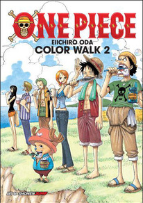
Shonen Jump presents Eiichiro Oda's color art for One Piece from the end of the Arlong cycle up through the middle of the Alabasta arc. Also included are some untranslated sketches, early works, and a conversation between Oda and Fujiko Fujio A. |
|||
| Review: | |||
Eiichiro Oda is a rarity these days – a weekly mangaka who declines to use a computer. That makes this collection of his color images – beginning with Arlong's defeat and ending with the start of the Baroque Works battle – all the more refreshing. This is the actual skill of the artist, not a bunch of filters. This is not to say that digital artwork does not require a high level of skill as well – because it absolutely does. What makes Oda's book so enticing is that his hand-colored images have a unity of medium that is often absent in more contemporary manga artbooks, lending this a warmth that his stylized art might otherwise lack. It is likely that Oda used brush-tip markers to color. The fact that you can make out textures and how the inks soaked into the paper, along with the subtle changes in overlapping colors, support this idea. This adds an authenticity to the pictures that the favored smooth digital style is lacking. While this doesn't speak to his artistic merit, it does provide more depth for budding artists and those who enjoy studying a picture in detail to appreciate, as well as inviting viewers to gaze longer at the page. The level of detail that Oda provides is all the more impressive for the fact that we know he isn't using the tools within Photoshop that allow an artist to easily replicate a pattern. This detail is undeniably one of Oda's greatest assets as an artist, allowing him to make up for anatomical shortcomings with compositional strength. Take, for example, the image on pages 40 and 41, which I like to think of as “Indiana Jones in Pink.” The image depicts the Straw Hat crew pre-Chopper exploring some ruins. Nami and her gun take prominence of place even while not being centered. She is in a dynamic pose, her skirt rucked up, a loaded gun ready for action, and a look of determination on her face. Zolo and Sanji, who share the page with her, are in more passive poses, guiding the eye to Nami. As the eye scans the image from right to left, background increases in complexity, leading the viewer towards the image's end. Where Nami is the most important and largest figure on the right hand side, the background takes precedence on the left hand side, slowly guiding us to the smallest figure on the page, Usopp. Usopp's pink backpack mimics the pink of Nami's accessories, giving the picture continuity that might not otherwise be there. Usopp's attitude of unbridled exploratory joy also serves as a counterpoint to Nami's reserved and cautious body language, creating an inversion between the two halves of the image. While it is possible that Oda was simply told to make Nami look hot, the fact that he composed such a complex image speaks volumes. Speaking of Nami, one of the perks of this book (for those who care about such things) is that you can watch her breasts inflate as the pages turn. It's subtle, and she is still within the realm of plausibility compared to her current portrayal, but for amusement value, look at the first page and then the last. It's quite the difference. More importantly, you can see Oda becoming increasingly comfortable drawing the female form as he takes fewer pains to cover her up and puts her in more dynamic poses. It is also interesting to note that Zolo frequently has one eye closed – the eye that he will later lose when Oda revamps everyone's character designs. The book is divided by year in small “chapters.” Each cover page has small images of sometimes iconic scenes from the manga and includes splash pages, color manga pages, and cover illustrations. A list in the back catalogs their provenance, but unlike other mangaka, Oda does not comment on each picture. He does provide the occasional remark, but they serve more to showcase his personality than to detail his process, such as “I kind of like trash heaps.” The interview, or rather moderated conversation, between himself and one half of the team that created Doraemon, Fujiko Fujio A, is somewhat more enlightening, as it discusses the reasons both men draw manga. Fujio makes some remarks about how shonen has changed since his debut, and Oda's near-worship of the man is abundantly clear. Footnotes are provided for obscure (to a Western audience) references. If you are a die-hard One Piece fan, you probably want this book. As a collection of Oda's color art, each image with its own unique composition, it is a good investment. A casual fan would need to be fond of the artwork itself, as the extras are interesting but do not shed much light on the man behind the manga and Oda's style is not universally loved. A lot of what makes these illustrations so wonderful is the way the personalities of the characters shine through their depictions. If the Straw Hat crew are your friends too, it might be worth it to pick up this book. |
| Grade: | |||
|
Overall : B+
Story : N/A
Art : A-
+ Compositionally varied and fascinating, personalities of the characters are evident despite a lack of story. Includes a postcard of the cover image. |
|||
| discuss this in the forum (20 posts) | | |||
| Production Info: | ||
|
Full encyclopedia details about Release information about |
||