Review
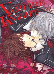
by Rebecca Silverman with Jennifer Silverman, MFA,The Art of Vampire Knight
Artbook
| Synopsis: |  |
||
Matsuri Hino presents various pieces of color artwork for her ongoing series Vampire Knight. Pictures include manga volume covers, LaLa magazine cover and promotional art, and special giveaways. Some artist commentary is included, as is a fold-out poster of the cover illustration. |
|||
| Review: | |||
Whether or not you are a fan of Matsuri Hino's supernatural drama, it is easy to be a fan of her artwork. Viz's presentation of her very first artbook may tempt even the cheapest, or most ambivalent, fans. The book is an oversized hardcover with a thick, textured slipcover that feels pleasant to hold. Pages are likewise heavy and glossy, though not so much as to make reflection an issue when gazing at Hino's work. Hino's technical skills are excellent. It is clear how every piece of clothing hangs on or drapes over the bodies of her figures, as well as how the outfits function in terms of fastenings, lending even the most complex garments a believability often not present in fanciful manga getups. This is especially noticeable on page 61, where the lacing on the back of Kaname's jacket shows the details of how the ribbon is threaded through the loops, and the fabric's tension is palpable. Even Hino's over-ruffled Gothic Lolita outfits still look as if the characters put them on rather than being sewn into them. Planning is evident in the logical placement of each strap and bow. Patterns on clothing are not flat, and Hino doesn't skimp on the effort required for such detail. Use of negative and positive shapes emphasize the details present in the larger pieces, allowing for a complexity that gives the eye plenty to feast upon. It helps that Hino is not necessarily bound by using every inch of space available to her. Some of her most striking images have ragged edges as if the white space is being peeled away from the page. This dislike of the conventional panels that bind mangaka (something she discusses in her commentary) allows for an individuality within the cliché of the paranormal beefcake that dominates most of the book. Indeed, attractive young men are a prerequisite of the vampire drama and Hino is more than willing to deliver. While there are females besides Yuki, most of the volume is dominated by suggestive images of well-muscled, smooth-skinned vampire males. While Hino is capable of drawing the male physique, it does make for a certain sameness among the images. Hino is able to draw many different angles and positions, both of which make for interesting compositions, but she unfortunately reuses the same elements over and over again. At least three-quarters of the book is comprised of Yuki standing between Kaname and Zero in various sexualized positions, including one where she is sitting open-legged in an armchair with a boy attached to each knee. (It is worth noting that the perspective is off in this image.) Another pose that Hino favors is two figures in a confrontational/cuddle position. This ranges between Yuki and Zero, Yuki and Kaname, and Kaname and Zero, all in variations on the corporal cuddling pose. These images have an invasive feel, as if the characters themselves are uncomfortable. Sexualization varies between the images. Most of the sensual pictures involve Zero and Yuki, although some homoerotic drawings, such as few images of Zero and his brother are also present. Phallic symbols and chains are rampant – Zero's gun, Yuki's scythe, and stakes all contribute to a pervasive sexuality. This is nothing new in the art world, where fruit (also present) can be nearly pornographic under the right circumstances. Proportions are generally good, but male hands and shoulders in a few images can be amusingly oversized. Hino understands the physical form quite well for the most part, but facial expressions are not her strong suit. They are seriously lacking in this book. Characters go between open-mouth and closed-mouth, bored, and mildly happy. Granted, this is a series about vampires, who are not given to chuckles, and the sexy nature of the blank, almost cruel stare is essential to the genre. That said, when all of your characters are glassy-eyed and staring intently at the viewer as she turns the page, there may be a problem. The one other major issue with Hino's art is that all of her characters look pretty much the same. With the absence of facial expressions and only a slight variation in hairstyles, you often wonder if you are looking at a page of clones with different hair colors. While Zero's tattoos do lend him some distinction, he is still basically Kaname with silver hair. Overall, this book is stunning. Interesting compositions, breathtaking color, and good use of line, shape, and space make this volume a very satisfactory experience. While the similarities of character design can be off putting, the fact that this book is in full color makes it easier to appreciate Hino's artwork than in the manga itself. Included details allow you to find something new each time you flip through. And since this bespeaks multiple viewings, that makes The Art of Vampire Knight a solid investment for fans of the series. |
| Grade: | |||
|
Overall : A-
Art : A-
+ Excellent composition, beautiful technical skills, attention to detail. |
|||
| discuss this in the forum (5 posts) | | |||
| Production Info: | ||
|
Full encyclopedia details about Release information about |
||